Northeast Michigan Healthy Food Initiative
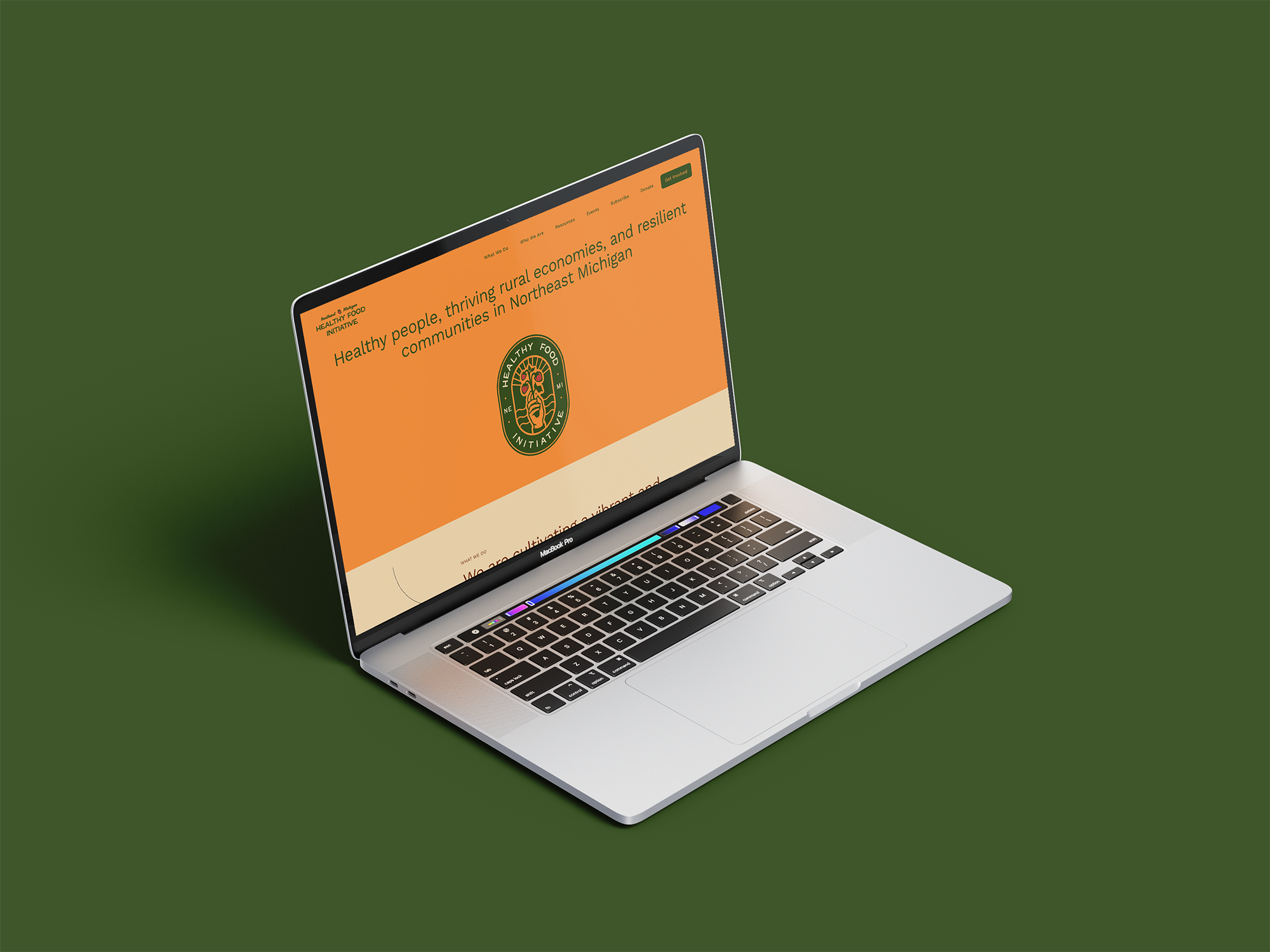
As a native of Northern Michigan, my interest was piqued when I got an inquiry from the Northeast Michigan Healthy Food Initiative. Given my background in food systems work, this was the perfect project! The group was looking for their first-ever brand design that could bring together a classic, timeless look while also looking fresh and professional. They wanted something that was meaningful and symbolic, not just a boring logo that ChatGPT could make. The result was a hand-drawn logo that evokes an old sticker. The group has gotten compliments galore!
Logo
The logo shows strawberries (a major crop in Northern Michigan) with sunrise rays over water to represent the 11 counties in Northeast Michigan, aka the ‘sunrise side’ of the state because the sun rises over Lake Huron. The visuals represent earth, water, and air elements needed to sustain agriculture.